Maya Romanoff
Showcasing luxury handmade wall coverings in a B2B Industry
Services
- Web Design
- Creative Direction
Strategy
Maya Romanoff had a dated site, lacking modern e-commerce features technical advancements, but the bigger problem was that it wasn't telling their story. They make handmade wall coverings in the United States, backed by a rich history and an inspiring, passionate founder, but little of this was actually surfaced. They wanted to level up how their luxury wall coverings were represented and tell their story in a way that actually drew people in.
Positioning challenges
Maya Romanoff operates in an e-commerce space, but their customers are mostly interior designers, which makes this fundamentally a B2B business. That changed how I talked about materials and how I surfaced buying. Rather than pushing toward checkout, CTAs focused on discovery, learning more, showcasing the products, and ordering samples. Designers work through professional accounts rather than guest checkout, so the flow had to respect industry norms.
Their goal was to build relationships with designers and show them what's possible, supporting a long-term sales approach.
Web Design
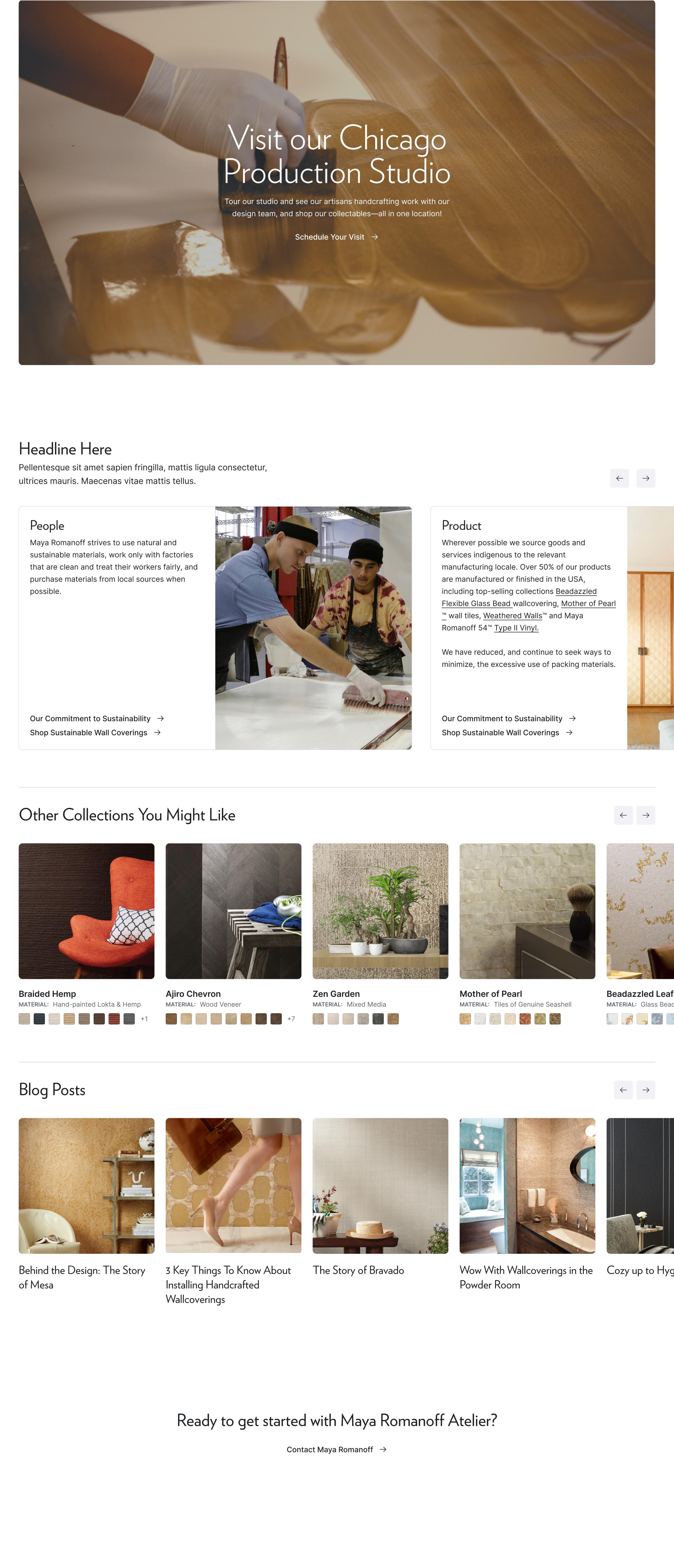
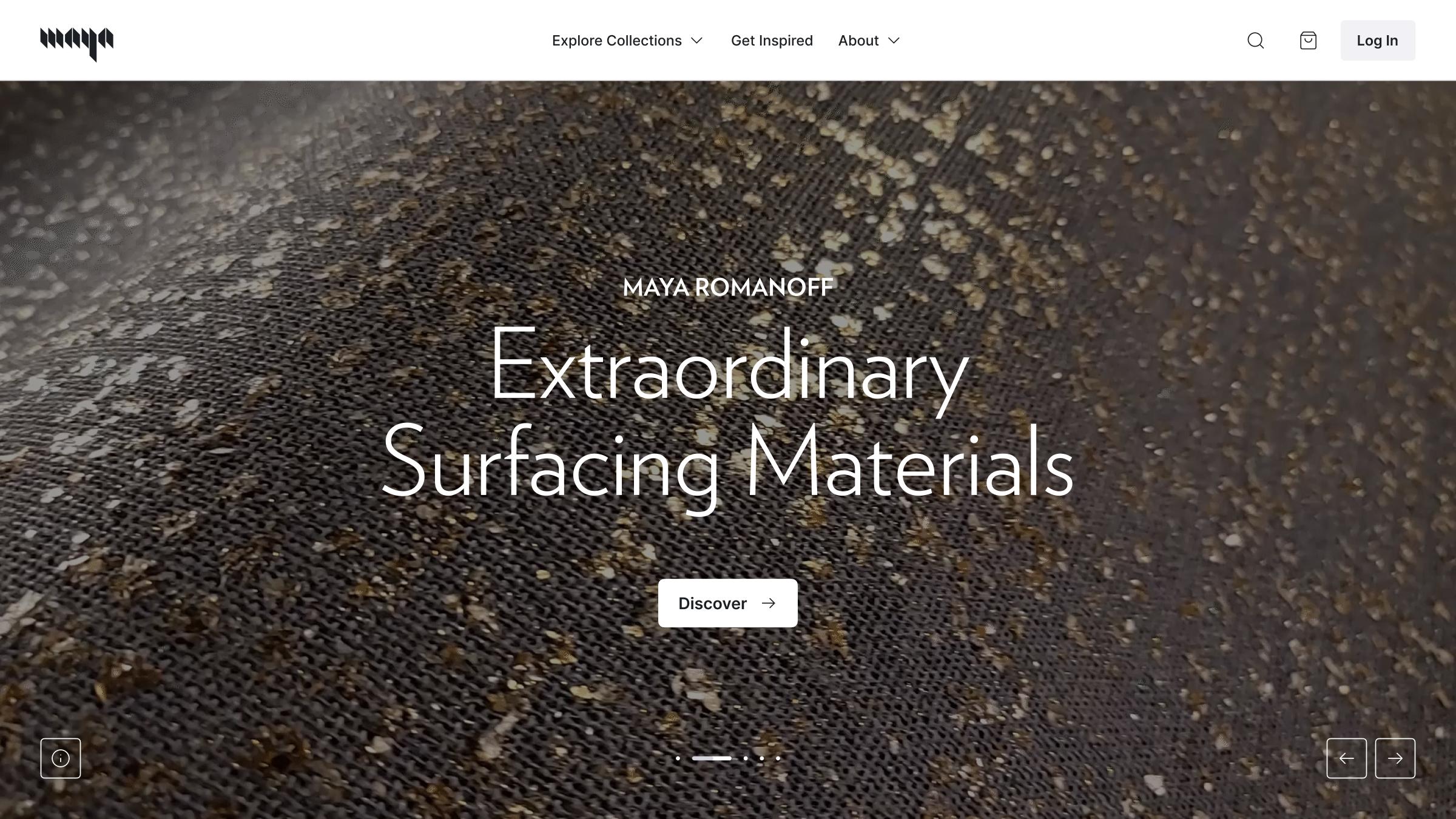
I designed a homepage that shows the depth of their legacy, while also drawing people into the diverse patterns and textures they produce. Starting with the hero, an immersive video pulls users into the rich textures they create and the handmade process behind them. From there I designed additional sections to tell different parts of their story and introduce the team, alongside inspiration galleries and carousels showing how the wallcoverings look in place, applied by working designers.
Product Pages
The product pages carried the most complexity:
- Relationship-focused content: highlight videos at the top of some product pages give designers a deeper introduction. This follows from the B2B approach: showing what's possible rather than pushing a sale.
- Complex variants: most product has a range of colorways, some with dozens. The client wanted to show legible thumbnails of each and an add to cart button directly from each swatch for easy sample ordering.
- Care and maintenance: each included extensive cleaning and upkeep information, worked in without crowding the product itself.
- Client-sharing resources: product images aren't only for the buyer. Designers need to share them with their own clients, so I added gallery views and easy image downloads.
Finding the Right Product
Sorting and exploration needed real depth. The collections menu lets people sort by category, color, material, and collection. On the collections page itself, filters cover themes, sustainability, and other criteria, so it's easy to narrow down to exactly the right material. I also surfaced their library of inspiration on the homepage and gave it a dedicated Get Inspired page.
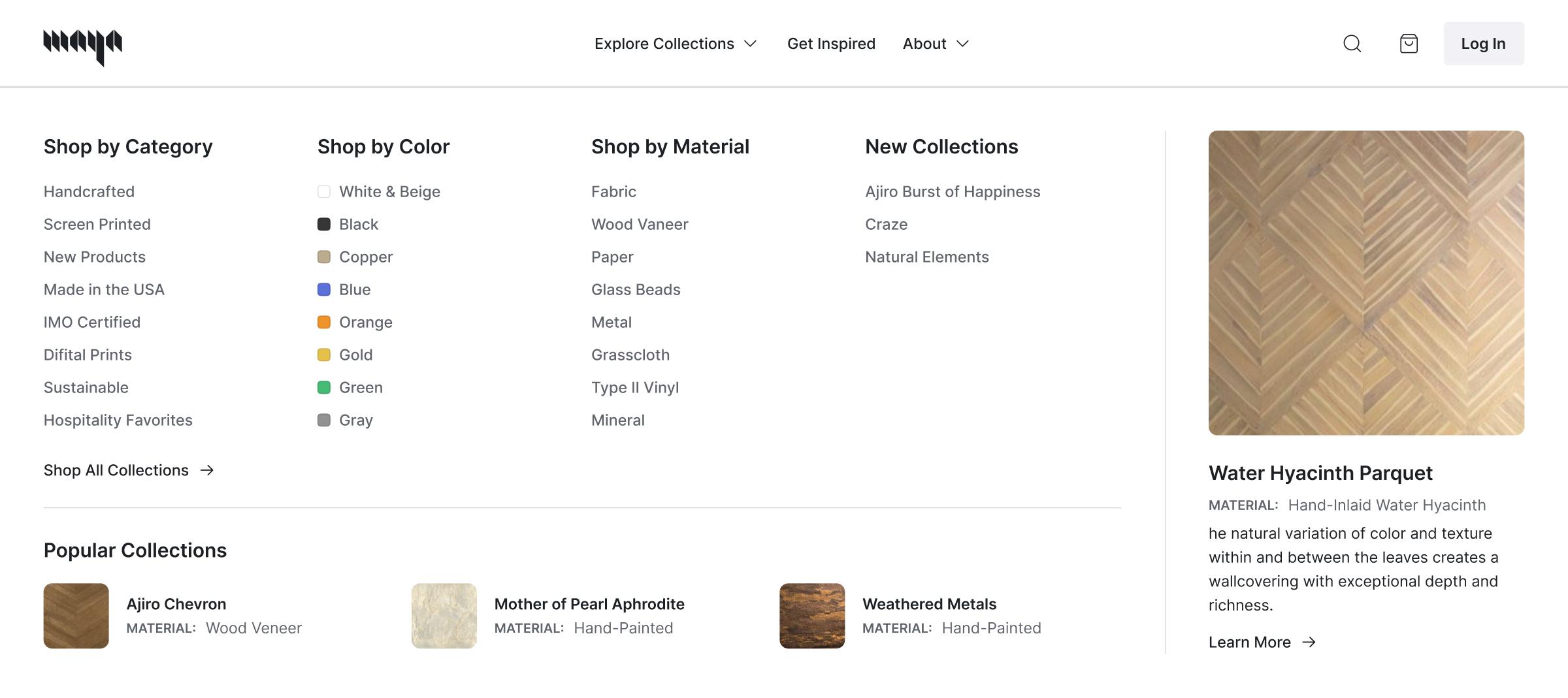
The "Explore Collections" menu dropdown showing shopping pathways
Search
With so many content types — each with different components and fields — search was its own challenge. I wanted people to land in the category they were actually looking for, so the search page splits results into tabs for products, blog posts, and pages, displaying each according to its own requirements.
From the search modal, a fuzzy-search dropdown shows everything together, highlighting top results while listing other categories below.
Built as a System
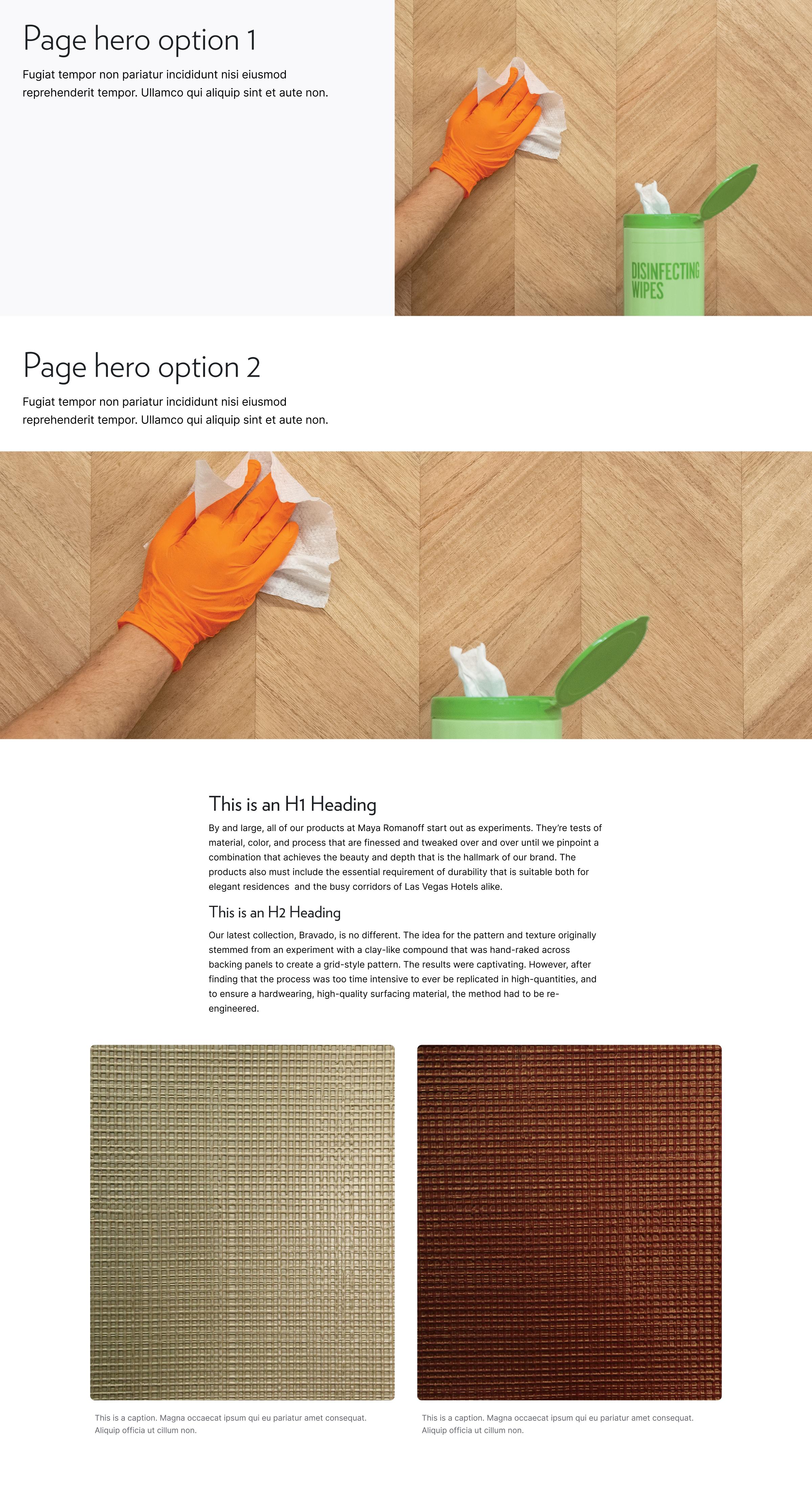
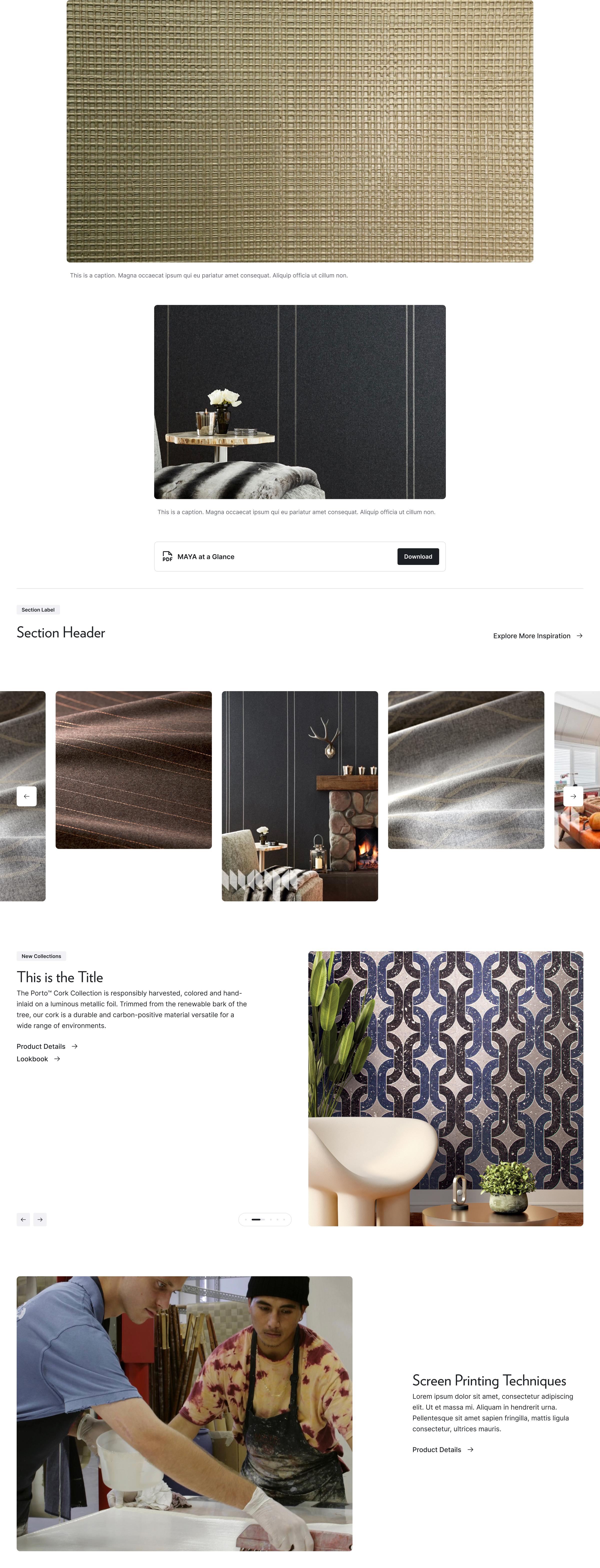
They wanted sections that were reusable and behaved more like a page builder. Every block was built as a cohesive section that could sit next to any other and still hold up — I kept that in mind for every single one. To carry that into development, I prioritized well-made Figma components with interactive states and modes built out, so pages could be assembled quickly and with fewer errors.
Throughout the site, I prioritized accessibility, making sure text, buttons, and other elements met industry standards.