Fulcrum Health
Merging four distinct networks into a unified visual identity and web experience

Services
- Web Design
- Creative Direction
Strategy
Fulcrum health connects providers, health plans, employers, and patients to provide better access to functional medicine. When I began working with them, they had a company website and four separate network websites that were the result of several acquisitions. They wanted a new site, built with clean and engaging design, that would bring these networks together and drive further engagement and familiarity between networks.
Bringing it Together
Each network had their own logo and color associated with it. These were historically separate networks, so users of one network were often unfamiliar with the others. We discussed a few options;
- Keeping logos as part of the network pages
- Preserving only the colors and subtle indicators on each page
- Pulling each network into the parent brand and preserving the names only
I pushed for the last option, merging into a unified brand, as the ideal option. The other options were pushing against their primary goal of aligning the networks within a single website and increasing engagement and familiarity across networks.
Brand Design
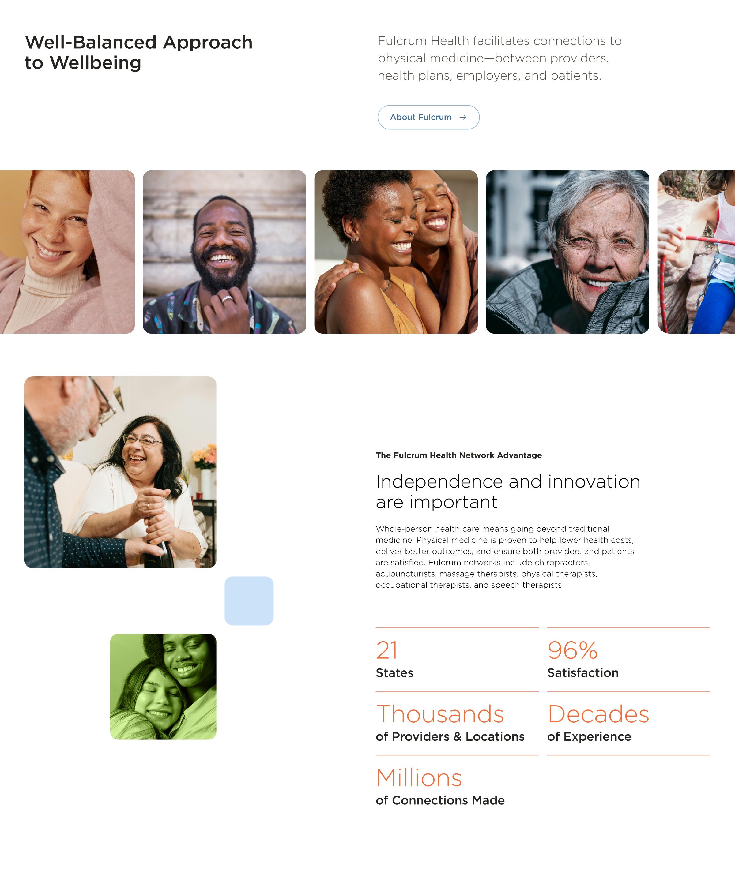
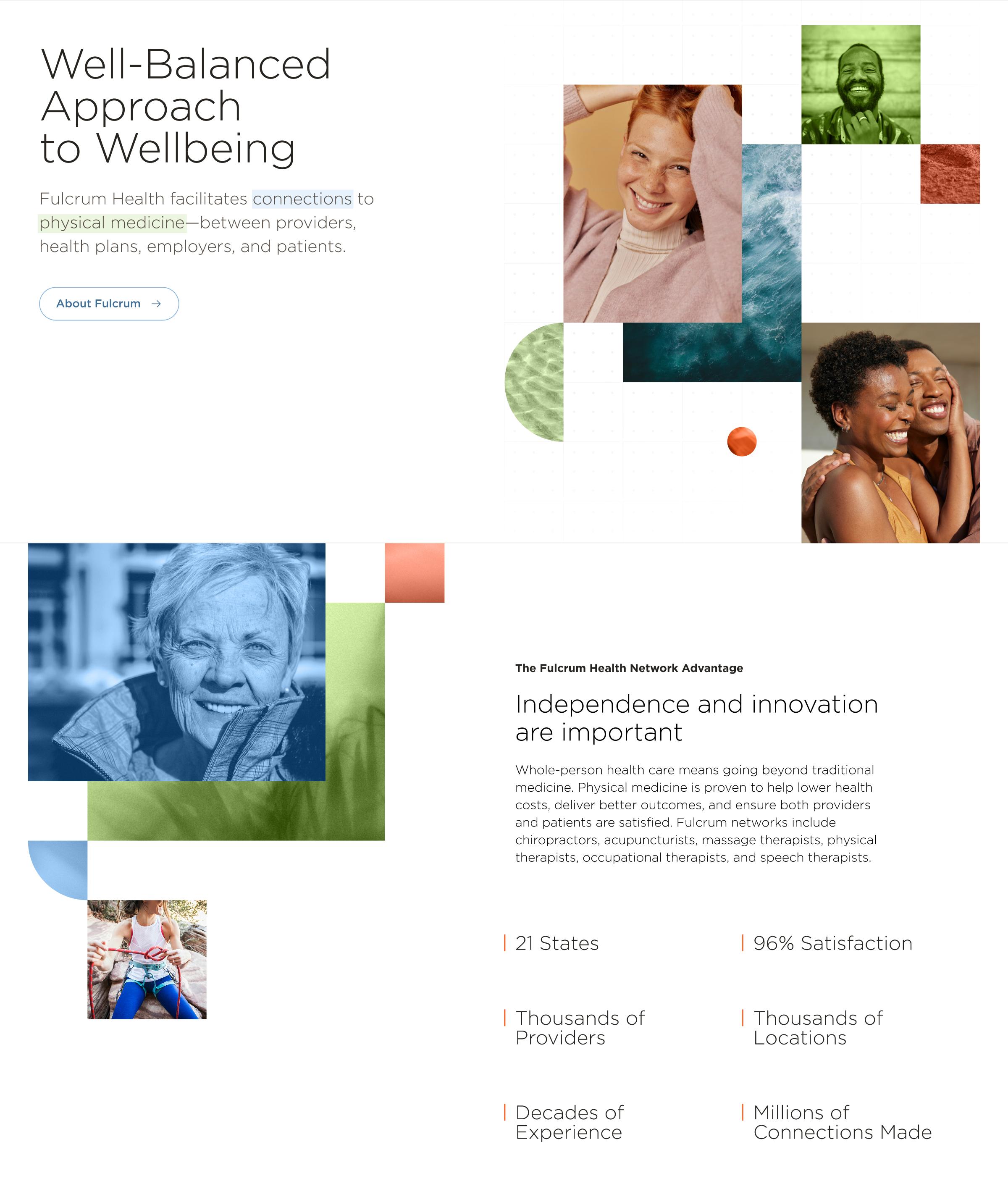
While brand design wasn’t a formal part of this work, their old site was outdated, and lacked a clear visual language. It was clear from their team that they weren’t ready for a larger rebrand, but wanted to make things feel current while maintaining fonts, colors, and their primary logo mark. After presenting a mood board and several visual explorations, I designed two versions of the home page to help narrow down on a final approach.
Web Design
I paired soft colorful gradients with vibrant photography focused on connection, to create a warm and joyful aesthetic. I created a consistent pattern of organic collages of images and colored squares that pulled viewers through the page.
A Robust Search Tool
One of the central tasks patients needed to do was to easily locate a provider in any network. I designed a search tool to enable quick and easy discovery of providers in their area. We determined that most users would be searching by provider specialty and location, so I put these filters front and center as required. Below I placed an expandable section, closed by default, to house advanced filtering.