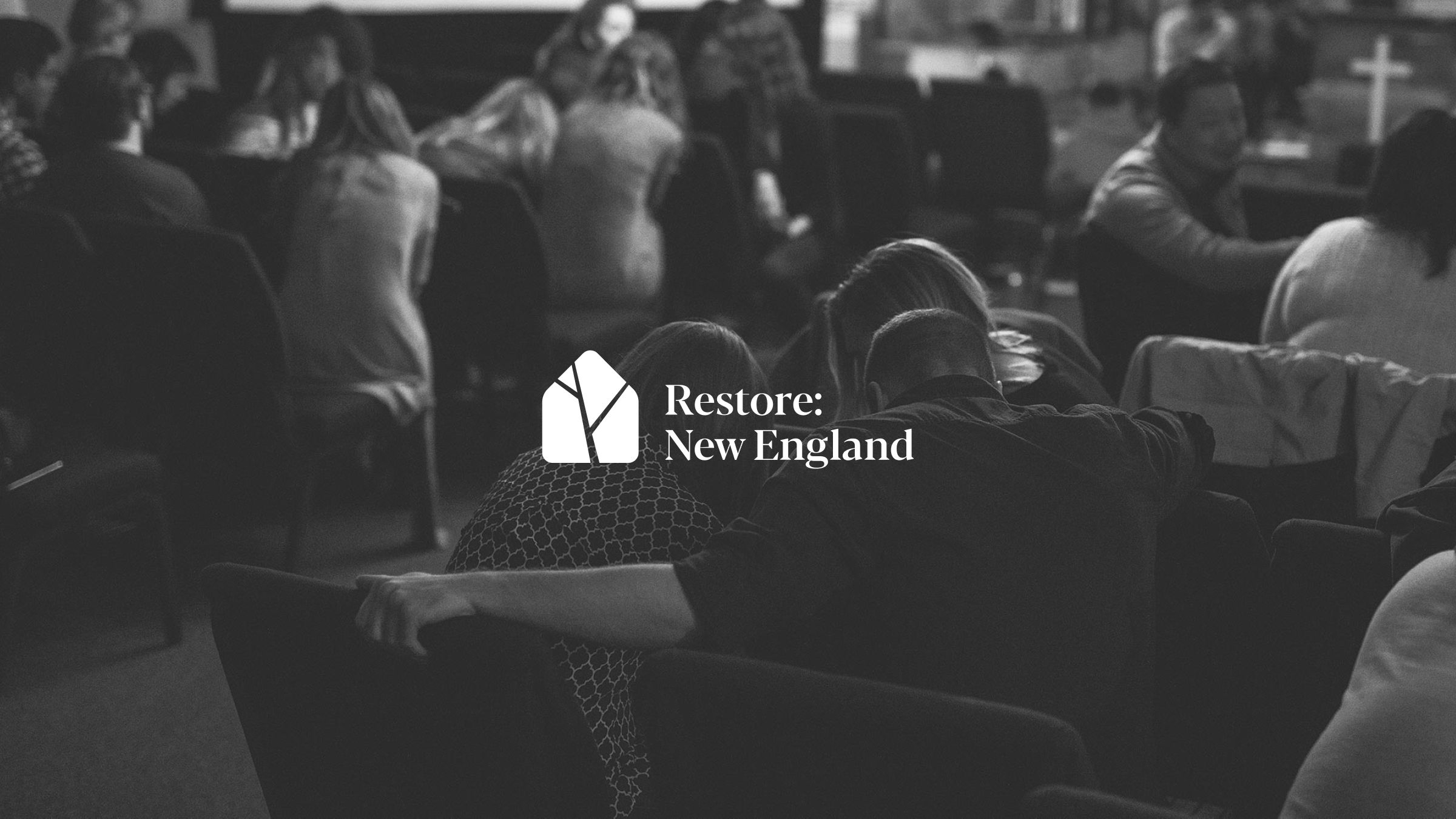
Restore: New England
Seeking the restoration of New England through a unified church


The primary function of the organization is to facilitate prayer gatherings at churches in the area. Through conversations with stakeholders, it became clear that the brand should not feel distracting or in-your-face. Rather, the voice and visuals should represent the supportive nature of Restore: New England. In addition, we wanted the brand to contrast the diversity of the people involved with the unity found in common restoration. These became key ideas in the naming process and the development of visuals.
The chosen logo mark was a simple house shape that visualizes contrasting realities. The pieces of the house can be seen as a mosaic of diverse pieces. There is a sense of fractured pieces being brought back together within one common family. Further, the negative space can be seen as a tree shape, to represent new life.
Despite these various attributed meanings, the logo doesn't rely on the viewer interpreting these things. It holds together as a strong and clear mark regardless, and allows the viewer to make their own interpretation.


